Personal Health / Data Viz
健康工作台
A local health workbench shaped by the need to organize years of longitudinal records. The Body Map reorganizes scattered lab, imaging, and symptom notes into a human-body perspective. The public case uses a fully synthetic demo image; real data and builds remain private.
- Role
- Owner / Product Engineer:从真实个人健康工作流出发,覆盖信息架构、前端、数据建模与隐私设计。
- Time
- Ongoing · 2026-08-24
- Platforms
- macOS / Desktop Web / Mobile Web
Turn years of real exam data into "what to care about today"
01 / Background
Why this exists: data scatters, decisions come too late
- Exam data is naturally fragmented: a different institution and format every year, reports sitting in PDFs and photo albums; by the time you need a real decision, the continuous picture is already lost.
- The real problem is not "no chart" but "no action" — you hold a decade of data yet cannot answer "what to watch this year" or "which item is quietly worsening".
- Two people's data stacked together is messier: the same metrics drift independently, and comparing by hand is slow and misses cross-signals.
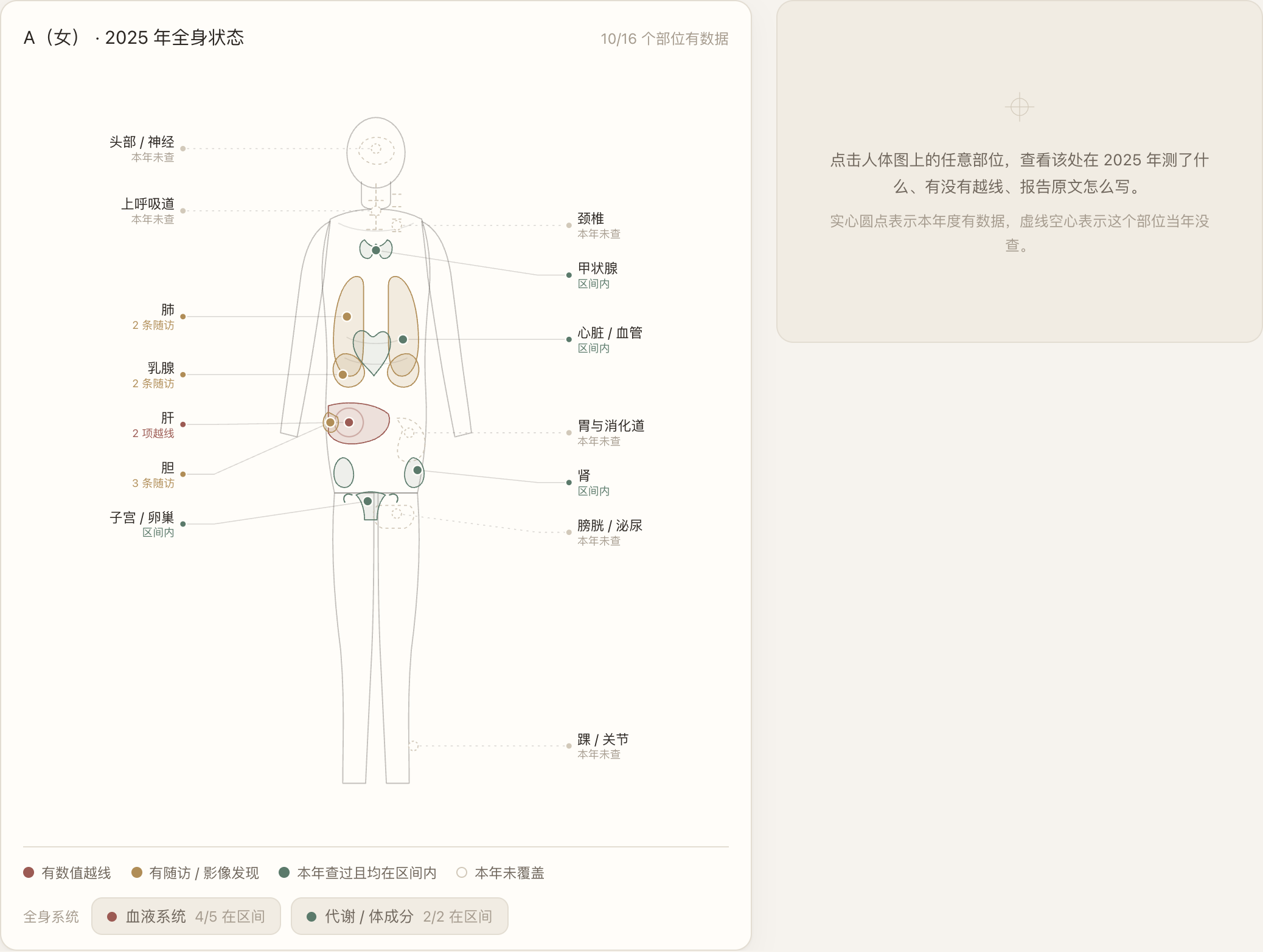
A fully synthetic target-experience concept showing the visual and information-architecture direction; it is not a screenshot of the current product.
02 / Vision
The ideal: turn years of real data into "what to care about today"
- I want a personal health OS: the first screen is not a metric list but "me" — what is stable, what is at the boundary, what was not checked this year.
- The long-term plan turns scattered points into a continuous narrative: year-by-year drill-down, traceable anomalies, generatable follow-ups, toggleable privacy. It serves the everyday self, not a single visit.
- It must be local-first and private; public demonstrations use a separate synthetic dataset instead of relying on a UI toggle to hide real data.
The project’s current priorities and delivered decisions.
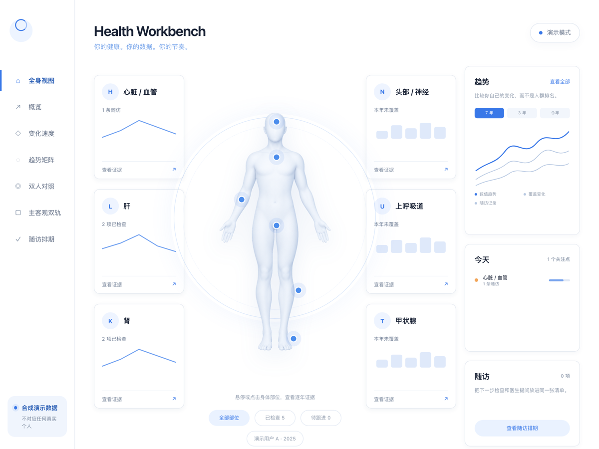
The current running Health Workbench interface; all values come from a separate synthetic dataset.
03 / Evolution
Evolution: from healthmeanagment to health-workbench
- The earlier healthmeanagment was a "privacy-first report parsing" exploration: it parsed a single high-privacy report into traceable insight and linked a long-term record chain, validating the "upload-parse-analyze-track" product feasibility.
- But it stopped at "one report" and never folded years of data into a people-centered main view. health-workbench is its mature form — no longer parsing singles, but folding years of data into the Body Map so that integration itself becomes the product.
- They are not a replacement but two convergences of the same idea: first validate parsing and privacy boundaries, then elevate it into a sustainable personal health OS.
The core path from input to outcome.
04 / Process
Process & thinking: from "metric list" to "body part"
- The first version was organized by department and metric; finishing it felt not intuitive enough — it echoed the hospital's taxonomy, not the user's view. The key turn was swapping the axis from "metric dimension" to "body part".
- The current build carries the concept information architecture into the real program: the body is the focal point, six implemented evidence groups surround it, and trends, today's focus, and follow-up share the right rail. Roadmap ideas such as sleep and nutrition are not presented as shipped modules.
- Narrative does not call an LLM: 6 rules (labs all green but imaging at risk / in-range yet fastest-moving / recurring for years / data gap / already recovered / two people diverge) generate "looks healthy but…" cues, each tagged with its data source.
- The transparent 3D body asset was generated for and belongs to this project, while accessible hotspots still open real region evidence. Trends and sparklines remain code-native, with no chart library or third-party product screenshot.
05 / Positioning
Positioning: personal decision aid, not a clinical tool
- It explicitly states "personal gauge only, not clinical": the health score is a rule (in-range ratio minus follow-up penalty) to help prioritize for yourself, not to replace a doctor's judgment.
- Local-first and private; real / masked modes are local viewing states, not a public security boundary. The public case uses entirely synthetic data and imagery. Seven views cover the body map, overview, velocity, trend matrix, two-person compare, qual/quant, and follow-up.
- The two-person compare is just one of the views — useful, but a sub-capability under the "integrated view", not the product's main axis.
06 / Efficiency
Efficiency: compress "flipping N PDFs" into one screen
- An annual review used to mean flipping through every year's reports, comparing by hand, then listing re-checks yourself; now you open to prioritized organs and drill into yearly values and annualized change in one tap.
- The follow-up view turns out-of-range / borderline items directly into a next-check list, removing manual整理. Public demonstrations are generated from separate synthetic data so convenience is not mistaken for privacy protection.
- What it saves is not seconds but the review you "would never have done" — letting long-term health records truly enter daily life.
Experience in depth
Pain points, user stories, and interaction design
Not a tech stack section. This is about the situation people are in, where they get stuck, and what I did about it.
My pain points
Every project here starts from somewhere I personally got stuck.
- P01
A new clinic and a new format every year leaves reports sitting in PDFs and photo albums, so ten years of data never form a continuous picture.
- P02
Having charts is not the same as being able to act — with a decade of data I still could not answer "what matters most this year".
- P03
Two people's data stacked together is worse: the same metric drifts differently for each, and manual comparison misses cross signals.
- P04
The first version was organised by department and metric. It restated the hospital's taxonomy and never answered the user's point of view.
- P05
Showing the product judgment to anyone else would have meant exposing real health data.
User stories
Written as "as … I want … so that …", each mapped to a verifiable product action.
- US01
As someone doing an annual review, I want the first screen to show me as a person — stable here, borderline there, untested this year — so I can prioritise immediately.
- US02
As someone tracking long-term change, I want to drill from any body region into yearly values and annualised change, so quiet deterioration becomes visible.
- US03
As someone fooled by all-green reports, I want the system to flag "looks healthy, but…" exceptions, so cross signals are not missed.
- US04
As someone scheduling checkups, I want out-of-range and borderline items to become a follow-up list automatically, so no manual compilation is needed.
- US05
As someone presenting this publicly, I want a one-click masked mode that keeps the product judgment intact, so privacy and presentation stop conflicting.
Experience journey
In real usage order: what they are doing, where it hurts, how the product responds.
StageWhat they are doingFrictionProduct response
01Collect
Feeding in years of reports, subjective symptoms, and historical imaging.
Formats and conventions change annually, so scattered data cannot be compared directly.
ETL runs parse → metric extraction → reference-range alignment → year stacking, turning scatter into computable structure.
02Map
Opening the first screen expecting to see a person, not a metric list.
Organising by department and metric simply restates the hospital taxonomy.
The primary axis moved from metrics to body regions; organ-map attaches metrics to regions and the Body Map becomes the first screen.
03Prioritise
Asking what deserves attention this year.
All-green labs can hide imaging risk, and in-range metrics can still be moving fastest.
Six explicit rules generate "looks healthy, but…" prompts without an LLM, each annotated with its data source.
04Drill
Doubting one region and wanting the yearly numbers.
This previously meant opening every year's PDF and comparing by hand.
Tapping a region drills into yearly values, annualised change, and the trend matrix on the same screen.
05Review
Turning the review into a next action.
Compiling follow-up items manually is exactly the work that never gets done.
The follow-up view converts out-of-range and borderline items directly into the next checkup list.
Interaction details
The micro-decisions that make it feel fluid or clumsy.
- Clickable body regions
- The full-body view uses state semantics for stable, borderline, and untested-this-year, and each region opens a detail panel.
- Real drill-down on the body
- The soft 3D body is not decorative: six accessible hotspots still open the corresponding longitudinal evidence.
- Every prompt is traceable
- Each "looks healthy, but…" line is annotated with its source and can be traced back to a specific year and metric.
- One-click real / masked
- Masking happens in the view-model layer rather than as visual redaction, so the product judgment survives the switch.
- Seven views, one view-model
- Body map, overview, rate of change, trend matrix, two-person comparison, subjective/objective tracks, and follow-up share one model without reloading.
Design details
Tradeoffs in the visual system, state language, and pacing.
- First-party 3D body, code-native charts
- The transparent body asset was generated for and belongs to this project; trends and sparklines remain code-native, with no third-party product screenshot.
- Rules, not an LLM, generate narrative
- Six explicit rules are explainable and reproducible, which suits a high-trust domain far better than uncontrolled generation.
- A stated non-clinical boundary
- The health index comes from in-range share minus follow-up penalties and is labelled as a personal, non-clinical scale.
- A seven-layer contract
- routes → data → view-model → primitives → feature → theme → verification, so any change maps to exactly one layer.
- Data separated from presentation
- Feature components only compose and never hold business rules; privacy is handled once, in the view-model.